
My role
Naomis is a company and the digital expert of the Keran group, they are specialised in digital transformation and GIS (Geographical Information System). When i worked for them as an intern, one of my missions was to redesign their main internal tool used to collect data.
Context
Naopad is a web application used to collect on-field data and create maps to visualize it. This app had 2 versions having different interfaces and functionalities each, making it harder to use for the customers and for themselves. My task was to build a new version making good use of the older ones.
Analysis of the older versions
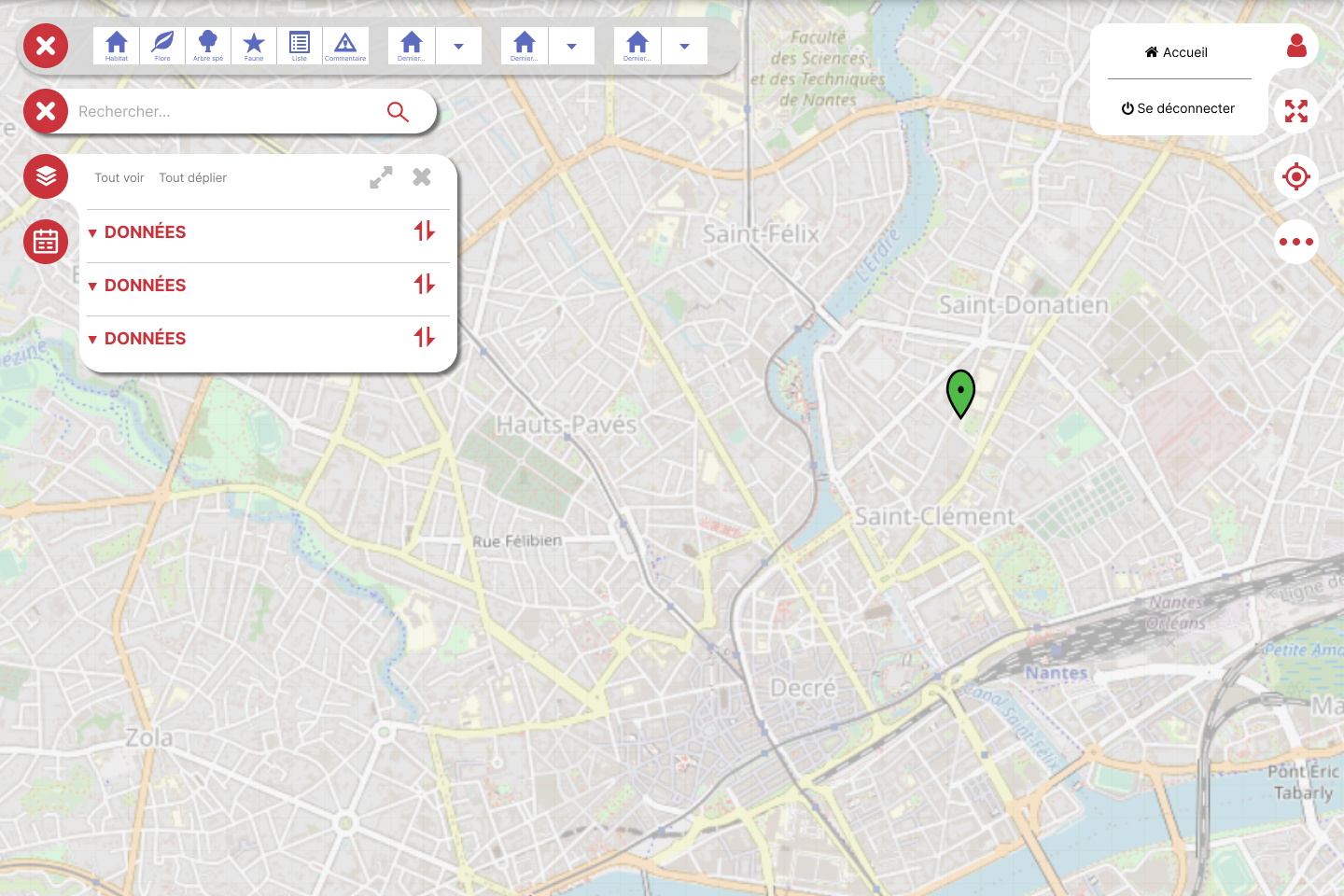
TOOLS
The organization makes it difficult to see the tools in both versions


DATABASE SET
It is the core of Naopad and is almost not present in V2 but takes too much place in V3
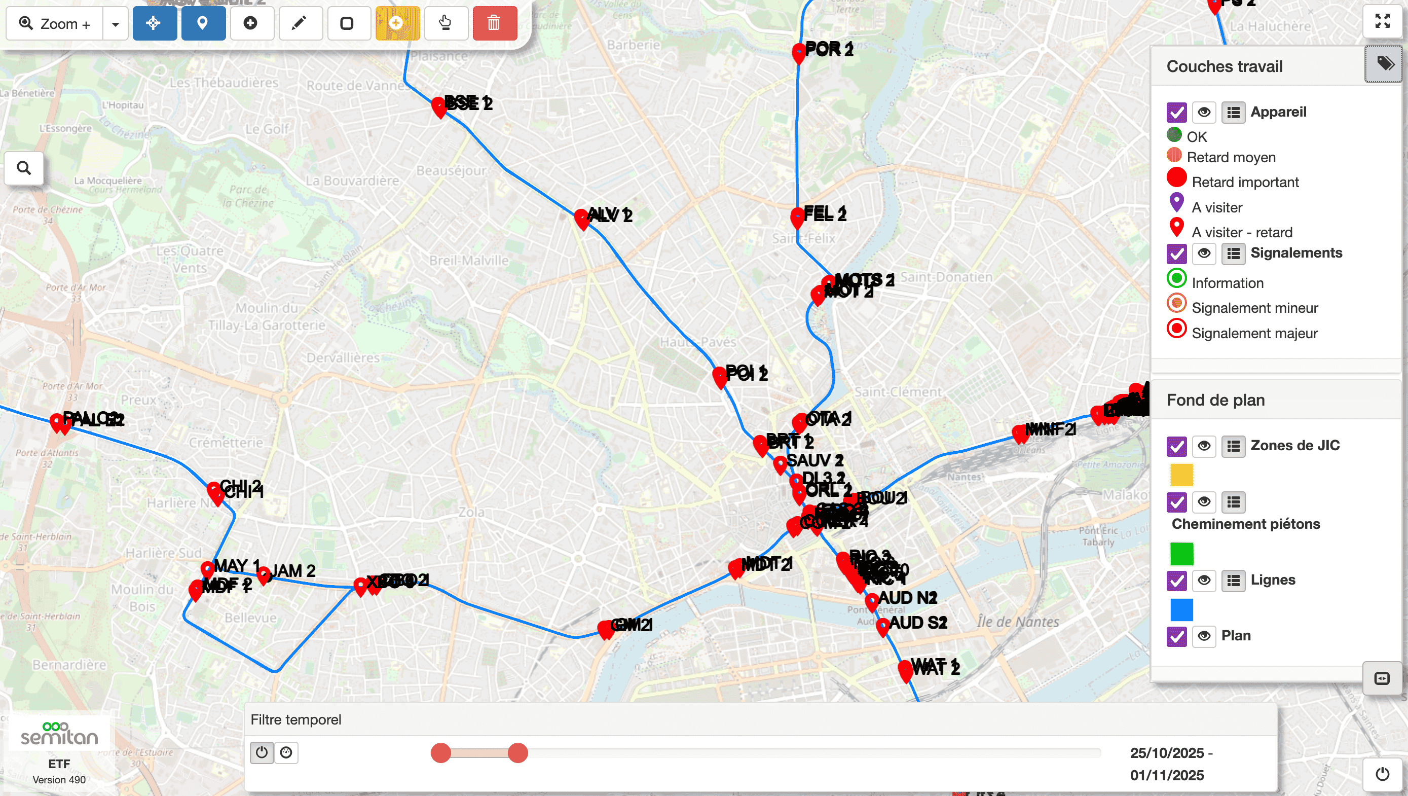
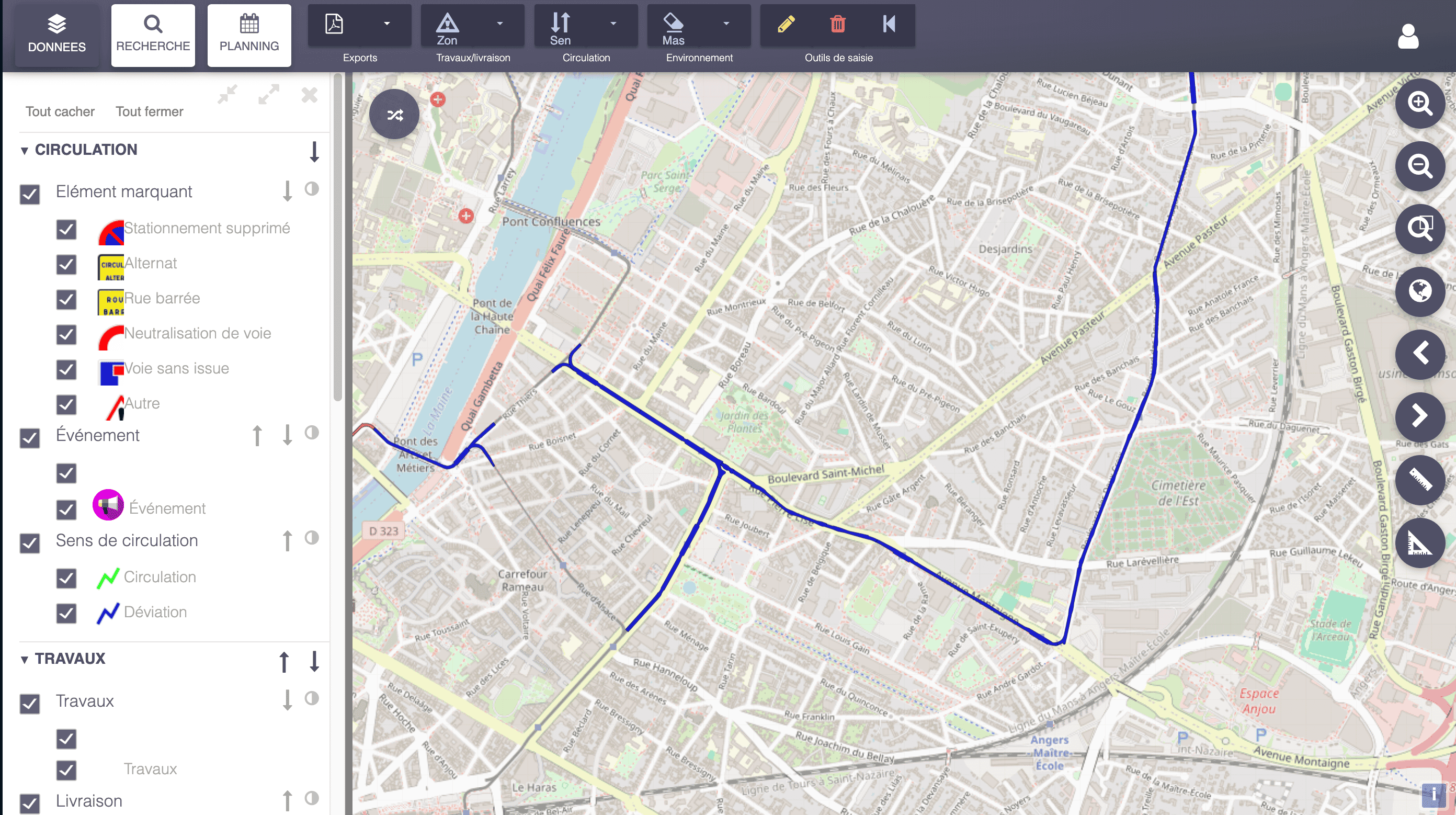
The V2 has a really simple design that doesn’t take up a lot of space, while the V3 is abundant in menus and windows, making it difficult to use.
The challenge
This application is a cluster of projects with different purposes. Thus both of these functionalities and interfaces need to adapt to the needs of each project.
Having a responsive design is essential to not overload the interface.
Upgrade
I had to work by keeping different aspects in mind : create a minimal design to ease the interface but with simple and relevant icons that can convey meaningful sense for a variety of projects.
I worked first by reducing the size of the menus and render them more responsive on the data displayed.
The variety of projects caused an overuse and misuse of icons. By working closely with the field team, I create new set of icons to adapt better to the different uses for both the data displayed and the tools used on the field.
![]()